


How can high-contrast design improve the readability of house numbers on signs and signage from a distance?
Release Time : 2025-10-11
On city streets, in residential areas, commercial buildings, and public facilities, house numbers are essential information carriers for precise location and efficient wayfinding. Whether for express delivery, emergency rescue, or everyday visitor navigation, quick and accurate house number recognition is crucial. However, many traditional signs are poorly designed, making them difficult to read in low light, in poor weather, or from a distance, seriously impacting their effectiveness. Therefore, high-contrast design is becoming a core principle of modern signage. By strategically combining color, material, and font, it significantly improves the visibility and readability of house numbers, playing a crucial role at long distances.
1. What is high-contrast design?
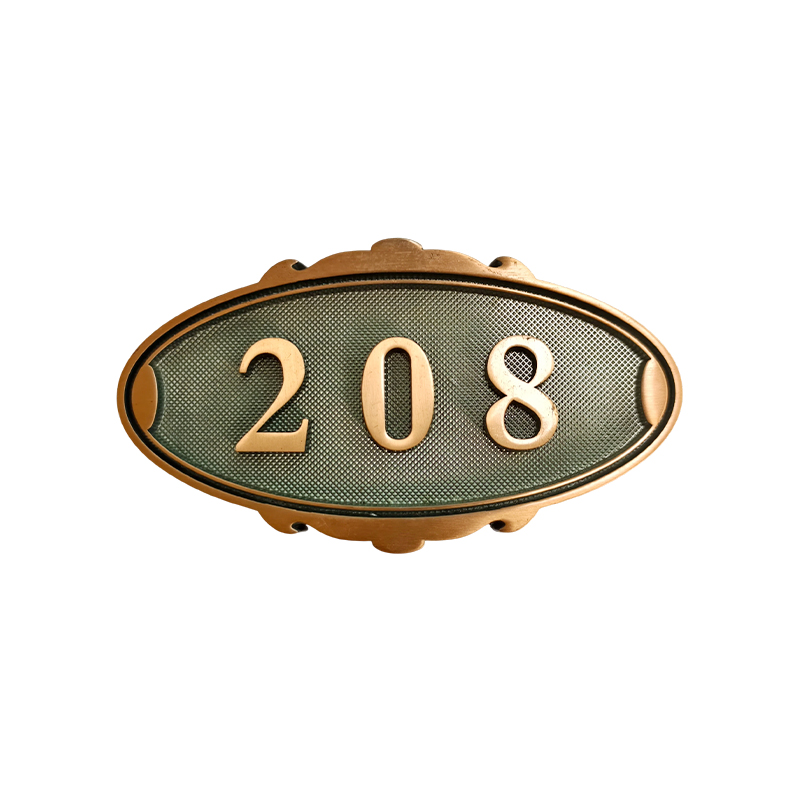
High-contrast design refers to creating a significant contrast in light or color between the sign background and the text/numbers, making the information more visually prominent. Common high-contrast combinations include white text on a black background, black text on a white background, black text on a yellow background, and white text on a blue background. High contrast effectively enhances edge recognition, helping the human eye quickly capture key information against complex backgrounds.
2. Visual Challenges of Long-Distance Recognition
In practical applications, house numbers often need to be recognized at distances of 10 meters or more, especially on wide roads, around tall buildings, or in traffic. Under these conditions, the image resolution received by the human eye is significantly reduced, blurring details. If the house number's color is close to the background, it easily blends in with the surroundings, resulting in a "visible but unclear" appearance. Furthermore, low-light conditions such as dusk, rain, and haze further impair recognition. High-contrast design effectively overcomes these obstacles by enhancing visual contrast, ensuring that information can be quickly captured even at long distances.
3. Color Science: Choosing the Optimal Contrast Combination
Color selection is key to high-contrast design. Research shows that a black-and-white combination has the highest light reflection difference, with a contrast ratio exceeding 20:1, making it the gold standard for long-distance recognition. A yellow-and-black combination excels in low light and dynamic viewing conditions, making it commonly used in traffic warning signs and also suitable for nighttime house number recognition, where recognition is crucial. A blue-and-white combination offers excellent visual comfort in daylight, making it suitable for residential areas. Avoid using low-contrast color combinations, such as red and green, blue and green, or gray and white. These color combinations are not only difficult to identify but may also cause problems for people with color deficiency.
4. Material and Surface Treatment Enhance Visibility
In addition to color, the choice of material also influences contrast. High-gloss reflective film enhances brightness at night, improving visibility from long distances, while matte surfaces reduce glare and are suitable for bright sunlight environments. Some high-end house numbers utilize 3D engraving combined with backlighting or embedded LED technology, allowing the numbers to self-luminate at night, creating an active light source and significantly improving recognition efficiency. Furthermore, using a matte material against a dark background absorbs ambient light, making bright numbers stand out more prominently and further enhancing contrast.
5. Font and Size Optimize Information Communication
High contrast requires the appropriate font and size for maximum effectiveness. It is recommended to use a sans-serif bold font with even strokes, clear structure, and resistance to distortion at distance. The height of the numerals should be determined based on the installation height and viewing distance. Generally, a minimum of 10 cm is recommended for a viewing distance of 3 meters, with the height increasing for every additional meter of viewing distance. At the same time, avoid overly decorative fonts or artistic designs, as they can affect recognition speed.
6. Adapt to diverse environments and enhance all-weather usability
High-contrast design also requires consideration of environmental adaptability. Avoid using green backgrounds in areas with dense greenery; prefer light-colored numbers on dark-walled buildings. For backlit or shadowed areas, incorporate lighting to ensure good contrast both day and night. Some smart house numbers are also equipped with light-sensing systems that automatically adjust brightness based on ambient light, ensuring high visibility in all weather conditions.
High-contrast design is not just an aesthetic choice; it's also a functional necessity. Through strategic color matching, material application, and structural optimization, it significantly improves house number recognition efficiency at long distances, in low light, and under dynamic viewing angles, providing reliable support for city wayfinding, emergency response, and daily commuting.
1. What is high-contrast design?
High-contrast design refers to creating a significant contrast in light or color between the sign background and the text/numbers, making the information more visually prominent. Common high-contrast combinations include white text on a black background, black text on a white background, black text on a yellow background, and white text on a blue background. High contrast effectively enhances edge recognition, helping the human eye quickly capture key information against complex backgrounds.
2. Visual Challenges of Long-Distance Recognition
In practical applications, house numbers often need to be recognized at distances of 10 meters or more, especially on wide roads, around tall buildings, or in traffic. Under these conditions, the image resolution received by the human eye is significantly reduced, blurring details. If the house number's color is close to the background, it easily blends in with the surroundings, resulting in a "visible but unclear" appearance. Furthermore, low-light conditions such as dusk, rain, and haze further impair recognition. High-contrast design effectively overcomes these obstacles by enhancing visual contrast, ensuring that information can be quickly captured even at long distances.
3. Color Science: Choosing the Optimal Contrast Combination
Color selection is key to high-contrast design. Research shows that a black-and-white combination has the highest light reflection difference, with a contrast ratio exceeding 20:1, making it the gold standard for long-distance recognition. A yellow-and-black combination excels in low light and dynamic viewing conditions, making it commonly used in traffic warning signs and also suitable for nighttime house number recognition, where recognition is crucial. A blue-and-white combination offers excellent visual comfort in daylight, making it suitable for residential areas. Avoid using low-contrast color combinations, such as red and green, blue and green, or gray and white. These color combinations are not only difficult to identify but may also cause problems for people with color deficiency.
4. Material and Surface Treatment Enhance Visibility
In addition to color, the choice of material also influences contrast. High-gloss reflective film enhances brightness at night, improving visibility from long distances, while matte surfaces reduce glare and are suitable for bright sunlight environments. Some high-end house numbers utilize 3D engraving combined with backlighting or embedded LED technology, allowing the numbers to self-luminate at night, creating an active light source and significantly improving recognition efficiency. Furthermore, using a matte material against a dark background absorbs ambient light, making bright numbers stand out more prominently and further enhancing contrast.
5. Font and Size Optimize Information Communication
High contrast requires the appropriate font and size for maximum effectiveness. It is recommended to use a sans-serif bold font with even strokes, clear structure, and resistance to distortion at distance. The height of the numerals should be determined based on the installation height and viewing distance. Generally, a minimum of 10 cm is recommended for a viewing distance of 3 meters, with the height increasing for every additional meter of viewing distance. At the same time, avoid overly decorative fonts or artistic designs, as they can affect recognition speed.
6. Adapt to diverse environments and enhance all-weather usability
High-contrast design also requires consideration of environmental adaptability. Avoid using green backgrounds in areas with dense greenery; prefer light-colored numbers on dark-walled buildings. For backlit or shadowed areas, incorporate lighting to ensure good contrast both day and night. Some smart house numbers are also equipped with light-sensing systems that automatically adjust brightness based on ambient light, ensuring high visibility in all weather conditions.
High-contrast design is not just an aesthetic choice; it's also a functional necessity. Through strategic color matching, material application, and structural optimization, it significantly improves house number recognition efficiency at long distances, in low light, and under dynamic viewing angles, providing reliable support for city wayfinding, emergency response, and daily commuting.